
Graphviz, Swimlanes, Deep Chronology, and Stemmatics
JamesPAscher
In his 2014 article for the Papers of the Bibliographical Society of America, Pervez Rizvi provides what his title promises “Stemmata for Shakespeare Texts: A Suggested New Form” (PBSA 108:1 (2014): 97-106). He argues that previous work on stemmatics, forming a genealogical tree of revisions of texts, ignores that some revisions happen to the same object. In other words, that within the history of the text as a particular sequence of words, there are embedded histories of physical objects and that these histories of physical objects are tied to multiple moments in the life of the text.
Rizvi describes a sort of time-line with two dimensions and proposes a two-dimensional chart, the swimlane diagram where each line represents the history of one object, but that arrows connect between the moments in the history of the object.
It seems to me that this captures one sense of deep chronology that we’ve been exploring as a Praxis team, that it has more than one dimension. Ethan Reed had brought The Concise Oxford Chronology of English Literature as an example of what he called “the most disgusting kind of historicism possible” where two events occurring at the same time must have some sort of relationship. We all laughed, but what’s funny here is that causation moves on multiple axes at the same time; what causes the year to flip from 1688 to 1689 may or may not relate to the Act of Toleration or Locke, but these all occur within time. Chronology seems valuable because proximate events are often related, but are not always.
Rizvi’s swimlane stemmata appeal to me because they incorporate two chronologies simultaneously, those of the object and those of the text. This seems like a step toward what we mean by deep chronology, but swimlane diagrams seemed tied to Microsoft’s Visio and I’m interested in free software so I was curious if I could reproduce the charts with Graphviz.
For those unfamiliar, Graphviz is more like a programming language than a drawing program. You describe your nodes and what they connect do and the program draws it for you. Describing Rizvi’s “Figure 4” in this language I put the following code together:
digraph fig4 {
    rankdir="TB";
    graph [style="dotted" labeljust="l" splines="ortho"];
    node [shape=record];
    subgraph cluster_foulpapers {
            label="Foul Papers";
            foulpapers [label="Written by Shakespeare"];
    }

    subgraph cluster_faircopy {
            label="Fair Copy with Revisions";
            writtenbysh [label="Written by Shakespeare"];
    }

    subgraph cluster_promptbook {
            rank="same";
            label="Promptbook";
            promptbook1 [label="Copied by Scribe"];
            promptbook2 [label="Revised by Shakespeare"];
    }

    subgraph cluster_jaggardexemplar {
            label="Jaggard's Exemplar of Quarto (Q)";
            jaggardexemplar1 [label="Printed (1609)"];
            jaggardexemplar2 [label="Annotated (1623)"];
    }

    subgraph cluster_Folio {
            label="Folio (F)";
            folio [label="Printed (1623)"];
    }

    foulpapers -> jaggardexemplar1;
    foulpapers -> writtenbysh [style="dashed"];

    writtenbysh -> promptbook1;

    promptbook1 -> promptbook2 [style="invis"];
    jaggardexemplar1 -> jaggardexemplar2 [style="invis"];

    promptbook2 -> jaggardexemplar2;
    jaggardexemplar2 -> folio;
}
Each “subgraph” is one swimlane for Rizvi and each node is an instance
of a text. (If you want to understand the Graphviz language, check out
their excellent
documentation; if enough
people want a tutorial here, maybe we could write one?) You’ll note
that I’ve connected the two instances of the same object promptbook1
and promptbook2, as well as jaggardexemplar1 and
jaggardexemplar2 with invisible lines since they occur in a
praticular order, but otherwise all the connections are connections in
Rizvi’s article. Upon compiling, Graphviz generates this:
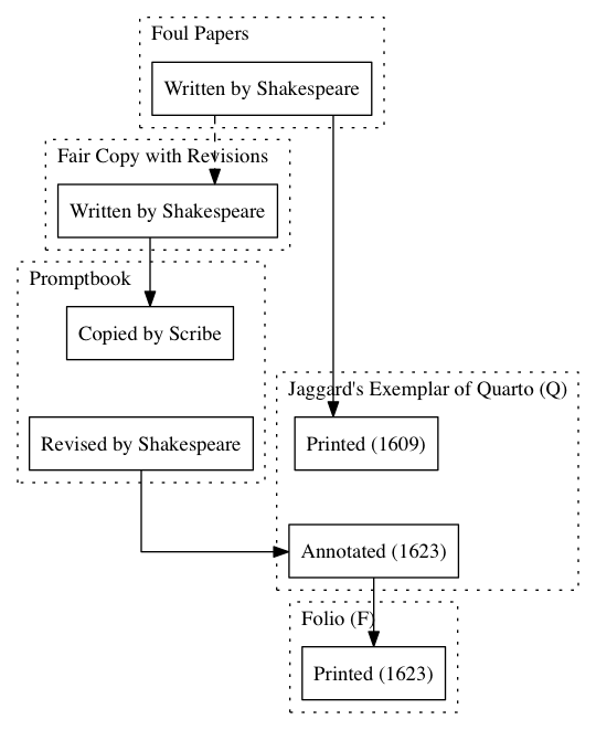
which you can see is quite different than Rizvi’s swimlanes (if you can access the article, if not, it’s fairly similar to the Wikipedia image above). With swimlanes the objects run in parallel lines whereas here they are clustered in a way to make the lines as short as possible, even the invisible ones. However, it still preserves the two layers of chronology that gesture toward deep chronology.
Fiddling with the code, I attempted another version using the record shape to contain all the instances of a physical object and the arrows to connect text transmission. The code is:
digraph fig4 {
    rankdir=TB;
    graph [style="dotted" labeljust="l" splines="spline"];
    node [shape=record];
    foulpapers [label="Foul Papers|<i1>Written by Shakespeare"];

    writtenbysh [label="Fair Copy with Revisions|<i1>Written by Shakespeare"];

    promptbook [label="Promptbook|<i1> Copied by Scribe|<i2> Revised by Shakespeare"];

    jaggardexemplar [label="Jaggard's Exemplar of Quarto (Q)|<i1> Printed (1609)|<i2> Annotated (1623)"];

    folio [label="Folio (F)|<i1>Printed (1623)"];

    foulpapers:i1 -> jaggardexemplar:i1;
    foulpapers:i1 -> writtenbysh:i1 [style="dashed"];

    writtenbysh:i1 -> promptbook:i1;

    //promptbook:i1 -> promptbook:i2;
    //jaggardexemplar:i1 -> jaggardexemplar:i2;

    promptbook:i2 -> jaggardexemplar:i2;
    jaggardexemplar:i2 -> folio:i1;

 }
Note that I’ve commented out the connections between the two versions
of the promptbook and the two versions of jaggardexemplar which
are now shown by being part of the same record. This generates the
image:
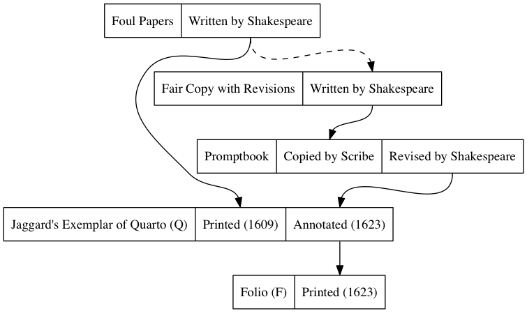
Lydia Warren thought this image was aesthetically better and I think it has much to recommend it as well. One thing I notice is that we can now cluster the records, giving us a third dimension of causation within time that could be charted.
##Next Steps
So, what is the next case study? One of the benefits of Graphviz is that it can be automated based on data generated by a program. In this case, I provided the code for it to compile, but the inventors meant for it to work with other programs that would generate code for it to draw. This brings me to the favorite obsession of “big data”, tracking social media. I’m very interested in tumblr and the social justice discussion there, particularly how someone will say something racist or sexist, someone else will call them out, and then a third person will call both of them in. (calling in is where you invite someone into a community and give them the chance to understand your point of view, rather than merely shunning them and pointing out their flaws; something that I think is coherent with our charter as a Praxis team.) In several of these cases, the discussions would fork and branch at each of these points and I’m curious if there is a particular topography to how tumblr quotes, reposts, comments on, notes, and alters their posts and if such visualization could be automated.
In it we have a deep chronology of several different people looking at the same event, but in a different light and those events being viewed by different people. I suspect that visualizing such a complicated network would begin to help explain what deep chronology could be in a contemporary, rapid-pace, computerized discussion board.
To this end, I’ve located the tumblr APIs, but I’m not entirely sure how to get at the “reblog_info” and the “notes_info” for individual posts.